Guardian App
Individual College Project
The Challenge
To create the ultimate personal safety app that would help users, who are alone and new to the area, to plan their day with the knowledge and tips on the areas they are visiting and the safe spots/net nearby.
“How might we safely navigate in a new environment?”
Research
I began with online research into assaults and what could help to avoid them or deescalate the situation. User research was conducted via online survey. It revealed that many users have been in a situation where they felt unsafe or were assaulted. Participants indicated that a product or a service for assault prevention could have been useful.
Persona
Andrea is a young woman who was accepted to a university in another state. She does not have a family or friends there who she can trust. Andrea likes to plan her outings and leave nothing to chance. She wants to enjoy her student years with safety on her mind.
Market Research & Analysis
Market research was conducted with 14 safety apps currently on the market to compare them with the features that Guardian app would offer.

- Most of the safety apps on the market have GPS and emergency alert functions and serve as an emergency tool rather than education and resource hub
- One of the apps though, My SafetiPin came closest to Guardian with features such as:
- Safe places
- Safer routes
- Safety score for the area
Even though there are similar features with other safety apps on the market, the Guardian app offers a different approach that relies on education / information about assaults and how to prevent them from trusted sources. It also features a community of users who could support each other.
Solution
A mobile app that focuses on assault education and prevention, and provides tools to find help from the safe spots provided in the app and
the user community. It comes with an emergency SMS feature.
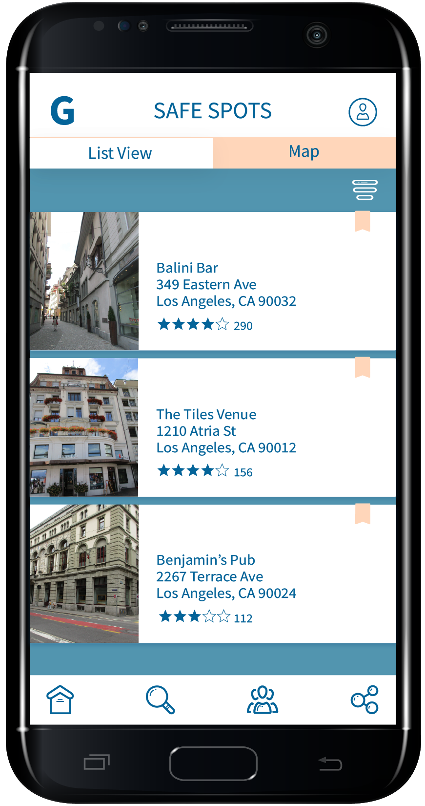
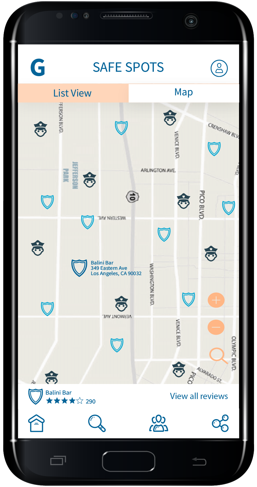
The Guardian app educates users on types of assault, provides tips from verified sources on warning signs of assault and how to avoid them. The app would also feature a community of users who can share their experiences, rate the city/town areas and establishments such as bars, party/event sites, and hotels on their safety level, and offer a helping hand if they are in close proximity. Users can get prepared for their night out, party, or trip by previously finding the safe spots for that area on the map. These safe spots can be employees at an establishment who will help users to get out of the dangerous situation before resorting to 911 call.
The Guardian app educates users on types of assault, provides tips from verified sources on warning signs of assault and how to avoid them. The app would also feature a community of users who can share their experiences, rate the city/town areas and establishments such as bars, party/event sites, and hotels on their safety level, and offer a helping hand if they are in close proximity. Users can get prepared for their night out, party, or trip by previously finding the safe spots for that area on the map. These safe spots can be employees at an establishment who will help users to get out of the dangerous situation before resorting to 911 call.
Prototyping
Sketches
Lo-Fi - Mid-Fi App Prototypes
Testing the Prototypes
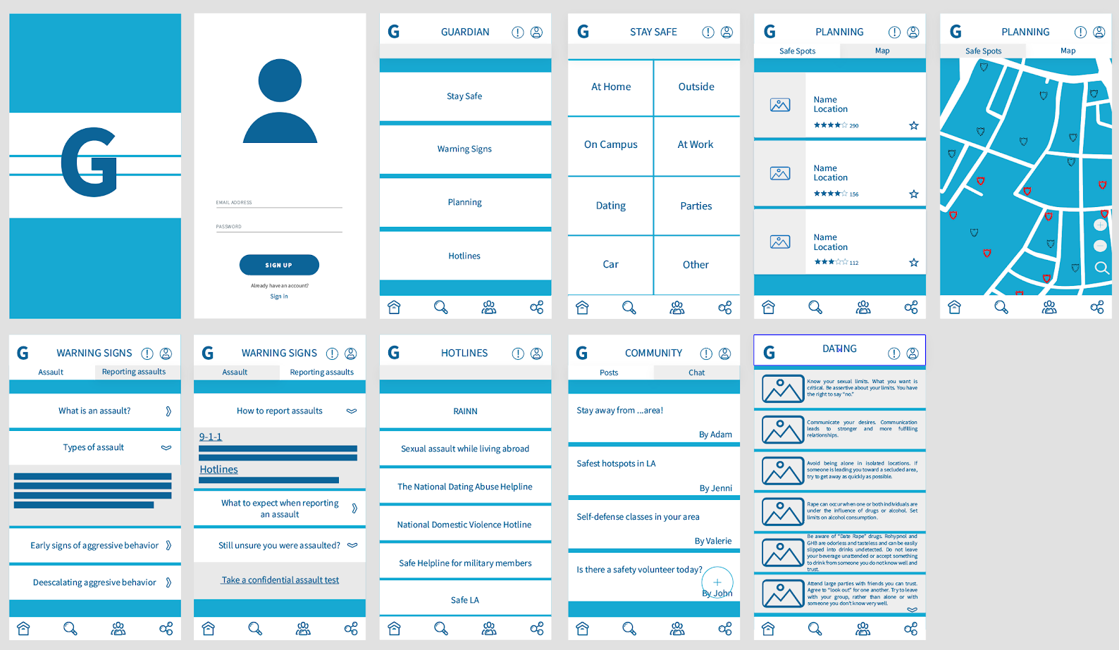
User Testing was conducted online due to COVID-19. It was challenging, but the results were no less informative. As the insights below show there was a confusion about the planning feature on the third screen, which is where users can find safe spots in the area they are visiting. The emergency feature was not yet introduced at this point to my prototypes.
Positives
“I love the concept! It's great to have all this information easily accessible.”
“The overall design is nice as a prototype, I like the blue it gives a sense of safety.”
“On the warning signs page it is clear when an option has been pressed.”
“Switching between options was also clear.”
“I like the community feature, it reminds me of nextdoor or citizen, where community members can report suspicious things or local crimes. I could see this being a highly used feature.”
Negatives
“The icon styles look like they're not the same between the top and bottom nav.”
“The option "Stay Safe" was not very clear what it would be until I clicked onto the next page, but given the available options it makes sense. Not knowing exactly what it meant made me curious to figure it out.”
“Is there an emergency feature? Is it necessary?”
“Planning makes me think of making a plan to escape domestic abuse. Are there steps to take and things to prepare in order to leave?”
“The electric blue feels urgent but maybe a different tone or shade could be more comforting?”
“Not sure what the Right side icon means on the bottom nav.”
“Is the (!) on the top nav warning signs? Alerts?”
Mid-Fi - Hi-Fi App Prototypes
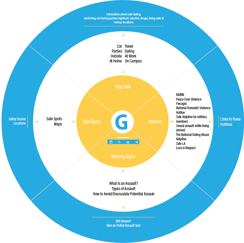
Guardian System Map
Guardian App Final Prototypes
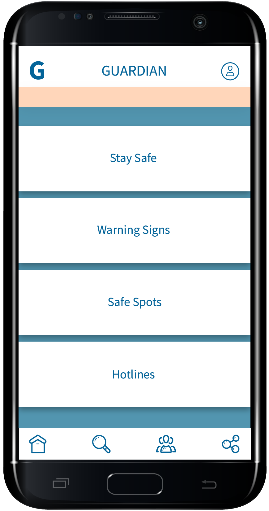
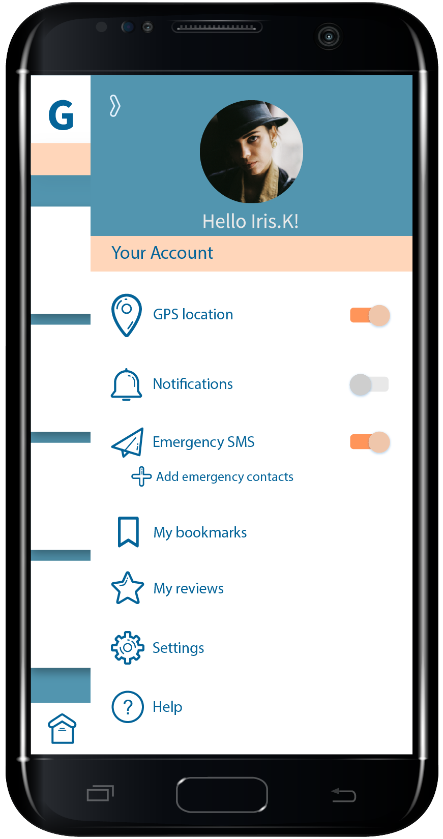
After I received the feedback for my prototypes I made the changes that would help users understand the app features better and utilize them well. Icons were adjusted and the overall color pallete was changed to make it more appealing. An emergency SMS feature along with GPS location tracking was added to the user account screen.






User Journey Map
For the user journey I introduced a scenario of how Andrea (my persona) would use the Guardian app to plan her night out with her new fellow students who invited her to a bar for a drink.
Final Look
Reflections
Some users asked for more features and gave an advice on where else I could get resources to add to the Guardian app. One of features they wanted was adding support groups in the community. I would like to include that feature into the Guardian app in the future. There was a considerable interest in the app and the features it offers. Women showed a particular interest in the app wanting to hear more about it.
